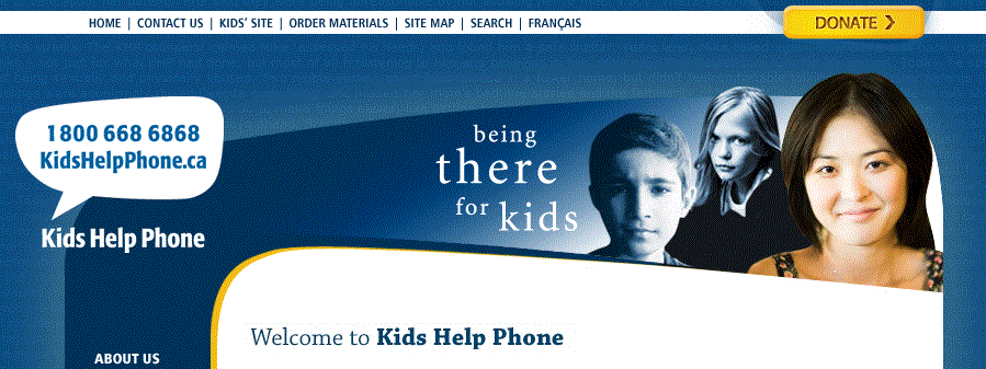
This may seem obvious, but the "donate" button on your nonprofit's website is big deal! Your supporters have become accustomed to it - they expect to see it when they arrive on your website. It's also the starting point for your online fundraising. Even though you may have other exciting campaigns going on, your "donate" button is a constant fundraising opportunity.
This simple button can be very effective - and we're here to help you perfect it! These questions may seem basic, but the answers could help make the difference in your online fundraising.
Where Should Your Button Go?
What good is a "donate" button if there's nowhere for it go? Your website should make giving a donation as easy as possible. If donors have a tough time finding the button they may change their minds, give up, or get distracted - all of which will cost your nonprofit a donation!
With that in mind, having your "donate" button at or near the top of your webpage is ideal, so that the donor doesn't even have to scroll down to find it. Many charities place their "donate" button in the top-right corner of their page. As the public has become used to that location, they will often naturally look for it there, making it a safe choice for to locate yours.

Your button should also stay static in that position on all of your pages, not just the homepage, so that the supporter can decide to donate after seeing other content, such as reading a news story you have shared, or checking out a description of your mission.
What Makes A Donate Button Stand Out?
In addition to where it goes, having an attention-grabbing "donate" button will also help make sure supporters can find it - even if they didn't set out to look for it.
When it comes to having a button that stands out, it seems that bigger is better! A bigger button and a larger font have both been found to increase the effectiveness of the "donate" button.
Colour is the other important factor, and just as bigger buttons seem to have benefits, so do brighter ones! For example, just changing the colour of their button from grey to red immediately brought Network for Good a 30% increase in donations!
In addition to brightness, research also shows that different colours can signal different reactions by supporters, which could alter their decision to donate. To create the specific feeling that will help spur donations to your cause, taking note of this research by Web Wise Business might be helpful.
What Should Your Button Say?
Regardless of how big your button is, research shows that keeping the message short and simple is the way to go. A short message still gives your organization tons of possibilities!
There are two effective ways to decide what to write in your "donate" buttons. When it comes to wording, "softer" messages appear to be most effective. In a study conducted by Engaging Networks, Torchbox, and WWF UK, 13 different button wordings were tested. The poorest performing ones were the most forceful, with messages like Donate Today or Join Now. The most successful had more friendly messages, with the top two being Join and Adopt or Donate.
In addition to the softer language, being specific appears to be beneficial as well. When the Clinton Bush Haiti Fund changed a message on one of their call-to-action buttons from Submit to Support Haiti, they saw donations per page view rise by 16%!
With the softer language of Support compared to Submit, and the specific mention of the cause, Haiti, this test seems to find a sweet-spot in "donate" button text.
What Works For You?
We've gone over some best practices, but it's always important to consider how these suggestions fit in with your organization and the overall look and feel of your website. Orange might often be a great colour choice for call-to-action buttons, but if your website already has a yellow or red theme, perhaps your button won't stand out. Likewise, a softer message like Support Haiti may be optimal for the majority of cases, but if Support can be taken to mean many other things in your cause, besides making a donation, it may be less effective.
If you aren't sure what works best, we recommend using A/B Testing - setting up your website to randomly use different buttons for different visitors, and seeing which has the best results over the testing period. From there, you can set your "donate" button exclusively to the best performer.
Get the latest trends and topics delivered to your inbox!
Subscribe to FrontStream's Blog